 framer · HeyBraza shows you
framer breakpoint changes affecting desktop
HeyBraza shows you which breakpoint is primary and points at the change that's leaking across sizes.
you tweak the mobile layout in framer and suddenly desktop changes too - or the other way round. it's the breakpoint inheritance model: edits flow from your primary breakpoint down, and structural changes affect all sizes. here's how to edit one size without breaking the others.
short answer
edits on the primary breakpoint cascade down; edits on a smaller one should stay local. if a phone change hit desktop, you edited structure (added or deleted a layer) rather than size - structural changes affect every breakpoint.
or do it yourself
- 1set desktop as your primary breakpoint, then add tablet and phone beneath it.
- 2remember the rule: edits on the primary breakpoint cascade down to smaller ones; edits on a smaller breakpoint should only override that size.
- 3if a phone edit changed desktop, you likely edited content/structure (adding/deleting a layer) - that affects every breakpoint, not just one.
- 4for size-only tweaks (width, spacing, font size), make them on the specific breakpoint so they stay as local overrides.
- 5to undo a bad cascade, fix it on the primary breakpoint first, then re-apply the smaller-size overrides.
steps last checked
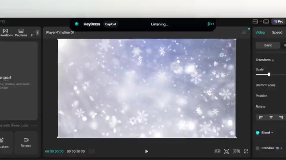
let HeyBraza do this with you
HeyBraza teaches you software while you're using it. hold a key and ask out loud - an ai tutor that sees your screen walks you through every step in real time, pointing and highlighting on your real work, talking you through it as it goes - not someone else's tutorial.
downloadcommon questions
why do my mobile changes affect desktop in framer?
adding, deleting, or reordering layers changes structure, which applies to all breakpoints - only style overrides (size, spacing) stay local to one breakpoint.
which breakpoint should be primary in framer?
set desktop as primary so changes cascade down to tablet and phone; the primary is the source the smaller sizes inherit from.
